UI Component Library with Storybook
One source of truth for UI components
One of our summer interns, Kate Straneva, describes her summer project of designing and creating a UI Component Library in Storybook, which showcases UI Components in isolation.
Project Overview
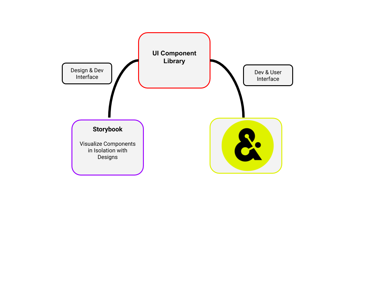
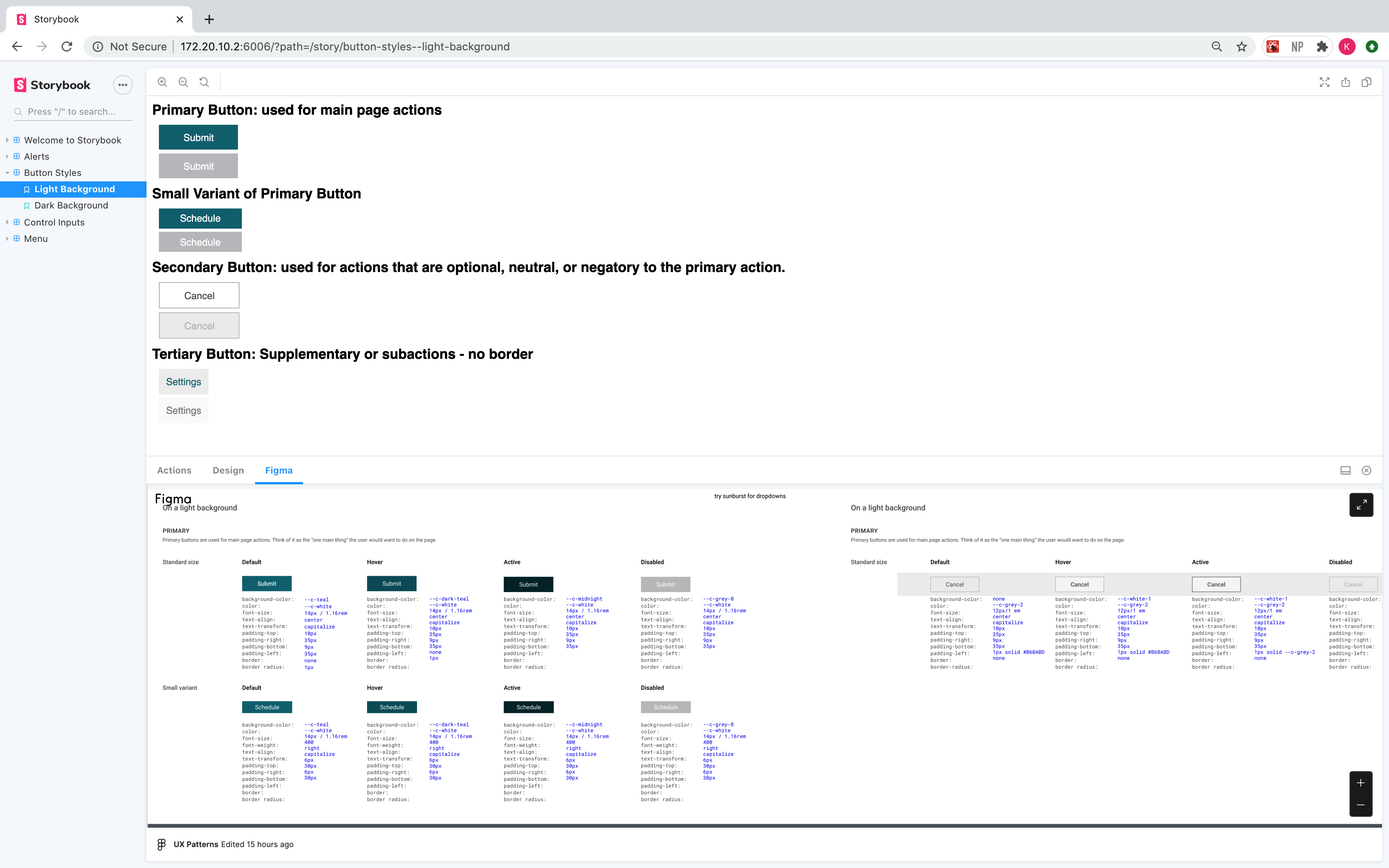
During my summer at Amperity, I created a new UI Component Library with Storybook, which enables developers to create components independently and interactively showcase these components in an isolated environment. In Storybook, the library features UI components in isolation and their possible states (i.e., disabled, active, hover, clicked) as “stories”. This project addresses three pain points:
-
Components in current UI Base library aren’t used or shouldn’t be used.
-
Imperfect translation from design to coded components.
-
Inconsistency in UI components across the app.
Development
The current UI Base library has become a catch-all for UI components across the app. Some of these components do not meet the design standards and/or are not able to be reused and referenced across the app, becoming an anchor to engineering teams as they roll out new features. With the adoption of the new component library, developers should be able to confidently reference this library as they roll out new features in the app.
Design
As new UI components are created, there is friction in translating wireframes to coded components. To mitigate this inconsistency, Storybook is integrated with our designer’s preferred design tool, Figma, so developers can view component designs while creating the components. Any design changes to the Figma files are automatically reflected in Storybook.
User Experience
Because some UI Base components aren’t easily reusable, we often accidentally introduce inconsistencies in the design of the app, creating a suboptimal user experience. As this library gets adopted As this library gets fully adopted, these bugs should be minimized.
Process
The most critical stage of the project was the planning process. Where will this new library live? Will this library have any dependencies with our other UI libraries? Which UI components should be prioritized? How do I ensure the success of this library beyond my internship? To tackle these, I relied on communication across stakeholder teams to design the library in a way that ensures its future success.
Communication Across Stakeholder Teams
I presented the goals of the new UI Component Library to the cross-team UI Guild and received feedback from both designers and developers. After this discussion, we decided that the new Storybook-based library will exist separately from the existing UI Base library. This approach collocates stories and components, which encourages developers to create new ones and enhance existing ones. Additionally, separating this library from UI Base allows incremental adoption, which is less invasive and requires fewer dependencies.
Open communication with the Design Team was crucial during this project to understand the component designs, use-cases, and which components should be prioritized. I worked closely with Diane Ha to review Figma designs and incorporate these designs in Storybook.
Development and Contribution Guidelines
After these conversations I established a workflow to ensure the library was developed iteratively. I prioritized components that users interact with the most in the app. These components included buttons, dropdown menus, textboxes, and checkboxes. Once I created these components, I then could start replacing them in the app. The final step in this process was drafting guidelines on how to make additions to this library to safeguard its future.

Helix
The UI Library was created using Helix, a wrapper for React that makes it easier to write React components using ClojureScript. A lot of Amperity’s frontend is written using Reagent, another React wrapper. The motivation for using Helix was its ability to create simple, fast components that can easily be used by storybook, our current application front end, and potentially other projects. Since Helix creates vanilla React components, it has first class support for React Hooks which are great for composing generic UI behavior.
Helix provides a collection of macros for creating components and elements. For example, the $ macro takes a component type (string, keyword, or symbol referring to a Component), optionally some props, and any children, and returns a React Element with that same information.
Here is an example of a button written using just React and ClojureScript-to-JS interop, which changes color when it is “on.”
(defn  my-button
  [props]
  (let [on? (goog.object/get props “on?”)]
    (react/createElement
      “button”
      #js {:style #js {:background (if on? “red” “black”)}}
      “Help”)))

(react/createElement my-button #js {:on?  true})
The same button component written using Helix which changes color when it is “on.”
(defnc  help-button
  [{:keys [on?]}]
  (d/button
    {:class (cx tertiary-button)
    :style {:background (if on? “red” “black”)}}
    “Help”))
($ help-button {:on?  true})
To learn more about Helix, checkout the GitHub repo (inc Will Action, Helix creator and UI guru).
Reflection
I really enjoyed this project because of the variety of stakeholders that benefit from the library’s creation: designers, developers, and users (win x3). I’m proud to have laid the groundwork for this library and I’m very hopeful for its future. I’m especially grateful to my mentor Martin Gordon for all of his support and guidance during this project. Thank you Team MAX and Amperity for having me on board summer and sharing your wealth of Engineering knowledge and authentic selves.